Complex EMR Redesign
PtEverywhere — January 2025
Redesigning a complex EMR patient list into a focused provider workspace
Helping providers quickly identify the right patients and take the right actions
without compromising clinical trust.
My role
Product Designer
Team
Design, Product, Compliance
Duration
2 months, phased rollout
B2B Healthcare
Clinical Workflows
EMR
Practice Management
Complex workflow
Context
PT Everywhere is a physical therapy practice-management and EMR platform used by Care teams & Clinics to manage daily operations. The product worked before, but now it feels messy as the company grows. I led a phased rollout of the redesign, prioritizing the Patient tab because it’s where the provider workflow begins.
The Challenge
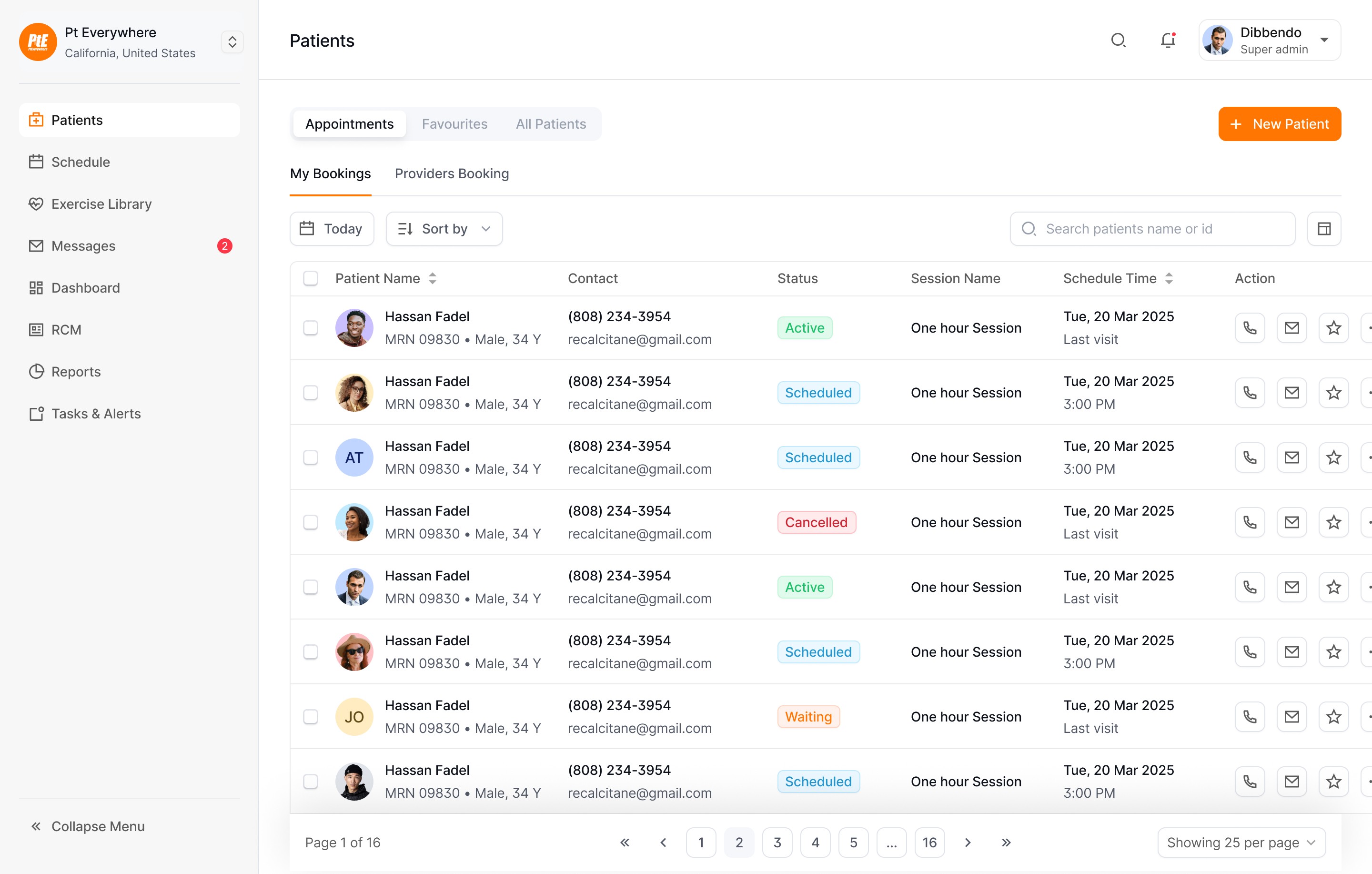
The existing patient workspace displayed all patient information equally, forcing providers to manually scan large patient lists to identify active patients, incomplete intakes, follow-ups, documentation issues, and billing-related cases.
User Problem
For Providers, this increased cognitive load
and slowed routine patient review.
Business Problem
For Clinics, delayed patient prioritization
reduced operational efficiency by 40%
Before
Patient Tab

1
Providers searched and filtered to figure out who needed attention first.
2
Providers then had to determine on their own what action to take next.
User group
Who are our users?
Each group had different needs, but they were connected through the same system — which meant a confusing provider workflow didn't stay a provider problem. It slowed the entire clinic's operations.

Constraints
The Constraint That Changed Everything
In healthcare, a redesigned interface can be dangerous if it hides important context. But a highly detailed interface can also be dangerous if it slows clinicians down or buries critical information. Showing everything creates cognitive overload.
Compliance-aware
Privacy & HIPAA-aware decisions from day one — Compliance in the room, not at the end.
Clarity vs. trust
Every simplification tested against: Does hiding this information remove critical context from clinical judgment?
Existing mental models
Providers had used the current workspace for years.
A radical redesign risked slowing experienced users.
Diverse workflows
Three-plus roles on one surface. No role optimized at another's expense.
Research
The real problem wasn’t the one I was asked to solve
I challenged the stakeholder's surface level assumption and dug deep to understand the real problem. The stakeholders came to design with a specific ask:
Stakeholder's ask
"Providers are struggling to find patients.
Can we improve filtering?"
Instead of taking the request at face value, I triangulated three signals — provider interviews, stakeholder input, and early usage patterns. The data told a different story:

01
Providers already knew how to filter; they just didn't trust the result.
02
The same list was serving three jobs at once.
03
Finding a patient wasn't the end of the task.
Providers could technically filter to any patient; what they couldn't do was quickly answer
"who needs me first? and what do they need?"
The Pivot
Filtering wasn’t the real problem. Providers could already find patients
— the bigger challenge was knowing who needed attention first and what action to take next.
Design Goal
How might we help providers quickly find & focus on the right patients without oversimplifying clinical decision making?

Exploratoin
Evaluating Multiple Design Directions
Before settling on the final solution, I explored concepts that addressed the same problem from a different perspective, but with different trade-offs.
Version 1

Why I explored it
Keeping the patient profile visible promised faster context switching & fewer page transitions. It reduced navigation between the list & patient details
Why I didn't pick it
The persistent preview reduced space for finding patients and became overwhelming with large datasets. Providers still struggled to prioritize who needed attention first.
Version 2
Why I explored it
A familiar table pattern minimized the learning curve and supported dense patient data. It aligned with how most legacy EMRs present information.
Why I didn't pick it
It optimized for displaying records, not helping providers decide what to do next. Important context was spread across rows, forcing constant scanning.
Design Decisions 01
Progressive Filtering : Simple First, Advanced When Needed
Providers could use many filters, but seeing all of them at once made the patient list feel more complicated.
Instead of exposing every option upfront, I redesigned filtering around progressive disclosure: the most common filters surfaced immediately, advanced options revealed on demand.
The trade-off: power users need one extra click to reach advanced filters, but the experience becomes much simpler for everyday use.
We accepted this trade-off because most providers only needed a small set of filters for their daily work.
Design Decisions 02
Saved Views for Role-Based Clinic Workflows
Different roles used the same patient list in different ways. A therapist, front-desk admin, and billing team did not need the same information.
I introduced Saved Views so each role could save their preferred filters, grouping, and table setup, then return to that view with one click. This made the workspace flexible for different clinic workflows without creating separate experiences for every role.

Design Decisions 03
Organize Before Acting: Group By and Bulk Actions
As patient volumes grew, providers spent more time scanning lists than delivering care. Instead of optimizing individual actions, So I inverted : organize first, then act.
• Group By structures patients into meaningful clinical and operational clusters (status, intake stage, documentation state), turning a flat list into a triaged one.
• Bulk Actions then let providers complete repetitive tasks across a whole group — safely, with compliance guardrails, and efficiently.

Design Decisions 04
Focusing on patients who need attention most
During testing, Providers told us even after filtering could still face long patient lists. I introduced Focus to surface the patients with the most urgent clinical or operational needs within the current view.
For example, after filtering to patients list, a provider could instantly narrow the list to those with incomplete intake, overdue documentation, authorization issues, or follow-up needs—turning a broad roster into a clear, actionable shortlist.

Impact & Takeways
Faster Patient Prioritization
65% reduction in time to first action during routine patient review.
Strong Interest in Saved Views
40% of active users said they would use Saved Views to support their daily workflows.
What to next
01
Proactive Patient Prioritization
The redesigned workspace helps providers efficiently find the right patients based on their current workflow. The next opportunity is to reduce manual prioritization altogether.
Instead of asking providers to search for patients who need attention, the system could proactively surface patients based on changing clinical or operational signals.
02
Shared Team Workspace
Today's redesign primarily optimizes individual provider workflows through Saved Views, Group By, and personalized workspaces.
A future iteration could introduce shared operational views that allow therapists, front desk staff, and clinic managers to coordinate around the same patient population while maintaining role-specific responsibilities.
Let's connect, I'm
only one click away
Website 100% built by hand
✱
Last updated Jun 2026